Design for Results
Prettier isn’t always better. Design is more than just making your next direct response fundraising piece (digital or print) look good. It’s about making it something that’s designed to get results!
Good design evokes emotion and action. It allows your donors to know exactly what you are raising funds for and why.
Here are three qualities that should be included in all of your designs:
1. Practical
Clear communication guides your donors to exactly what you’re asking them to do. What is the goal of this communication? Is it to acquire monthly donors? Gain newsletter subscriptions? Pick one primary call to action, and use design elements like size and color to direct readers to the action and minimize distractions.
2. Accessible
Know your audience. The average age of donors in the U.S. is 64 years old.¹ Is this the same or different than your average donor? If your donor base is similar in age, The Global Journal of Health Science provides an excellent resource of recommended design choices to accommodate older adults.² Some of the key elements here are keeping things simple and making your content easy to read. Avoid small fonts and large sections of reversed-out type.
3. Actionable
Use design tactics—such as size, color, and contrast—to draw attention to the call to action. Make it expressly clear what the reader is supposed to do.
To test if your designs make the cut, take some time this week to pull out some of your previous print and digital designs. Then, ask people in your donor’s demographic if they know what they should do as a result (which will likely be to give). Take it a step further and ask if they can tell you why they should give. If it’s not clear to them—or worse, unclear to you—then now’s a great time to start working on simplifying your designs to get a better response moving forward.
1Blackbaud Institute 2020 Charitable Giving Report
2Farage, M., Design Principles to Accommodate Older Adults
Related articles
-

Courage, Humility, and Faith Lived Boldly
There’s so much that I don’t know about the greatest leaders of our country. I’m trying to correct some of…
-

More Than Just Work
As a young Christian professional navigating the conundrum of aligning my beliefs into a purposeful career, I’ve been blessed to…
-
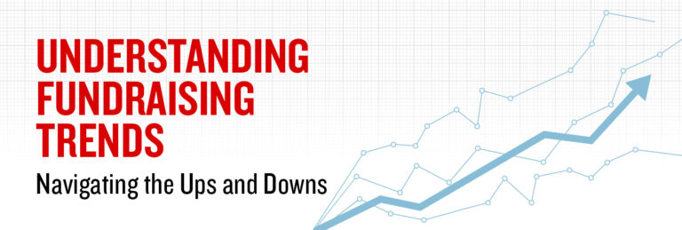
Understanding Fundraising Trends: Navigating the Ups and Downs
Many organizations are experiencing lower giving in 2022 than at any time in the past three years. Almost everyone we…